

A SaaS pricing page is rarely just a pricing document. It is often the final checkpoint before a prospect decides whether your product feels trustworthy, easy to understand, and worth the investment. High-converting pricing pages reduce friction by guiding buyers through a clear decision-making process instead of overwhelming them with features, plans, and technical language.
The strongest SaaS companies treat pricing pages as strategic conversion assets. They combine transparent structure, focused messaging, relevant social proof, and clear calls-to-action to help buyers move forward confidently. This guide breaks down the most effective SaaS pricing page best practices, including how to structure plans, reduce hesitation, improve trust signals, and avoid common mistakes that quietly hurt conversion rates.
SaaS Pricing Page Elements That Drive Conversions
The most effective pricing pages prioritize clarity above everything else. Buyers usually arrive at pricing pages after researching your product, comparing alternatives, or evaluating internal requirements. At that point, confusion becomes expensive. A clear hero section should explain what your product does, who it is for, and how pricing works within seconds of landing on the page.
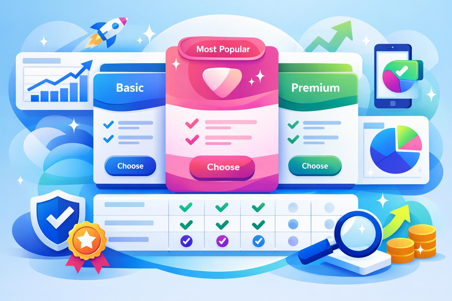
Strong SaaS companies also place pricing tables near the top of the page so visitors do not need to search for core information. In most cases, three or four plans create enough contrast for comparison without introducing decision fatigue. Many brands visually emphasize a “Most Popular” plan because it anchors evaluation and naturally guides users toward the preferred option.
“High-performing pricing pages help buyers make confident decisions quickly instead of forcing them to decode complex product packaging.”
Feature descriptions should focus on outcomes rather than technical capability lists. For example, a CRM platform targeting growing sales teams benefits more from explaining improved reporting visibility and faster follow-ups than from listing backend functionality. Buyers care about practical business impact first.
Many SaaS businesses separate pricing information into two layers. The first layer includes simple plan cards designed for quick scanning, while the second layer contains a detailed comparison table for procurement teams and advanced evaluators. This approach keeps the page approachable without sacrificing depth.
Pro Tip: If your SaaS platform includes multiple modules or operational workflows, organize plans around customer maturity or business complexity instead of exposing every capability at once.
Transparency also plays a major role in conversion performance. Hidden onboarding fees, unclear seat limits, and vague usage thresholds create distrust immediately. Buyers are often comfortable with complex pricing structures if the logic behind them is explained clearly. Companies managing operational data and subscription workflows through platforms such as MainFoundry can often maintain more consistent pricing communication across sales, finance, and marketing teams.
Trust signals should appear close to decision points rather than isolated at the bottom of the page. Customer logos beneath the hero section, concise testimonials near pricing cards, and security assurances beside CTAs all help reduce perceived risk. Enterprise buyers often evaluate compliance and platform reliability carefully, which is why linking to resources like enterprise-grade security information can reinforce credibility during evaluation.
Common Pricing Page Mistakes That Create Friction
Many pricing pages underperform because they overload visitors with complexity. Too many plans, too many feature variations, or multiple pricing models shown simultaneously can overwhelm buyers before they fully understand the value of the product. When evaluation feels difficult, prospects often postpone the decision entirely.
Visual clutter creates similar problems. Dense paragraphs, crowded comparison tables, inconsistent formatting, and competing CTAs make scanning difficult. High-converting pricing pages feel intentional and organized. Weak pages often resemble product documentation rather than guided buying experiences.
Pricing pages convert better when they simplify evaluation instead of maximizing information density.
Another frequent issue is poor alignment between plans and customer segments. Startups, scaling teams, and enterprise organizations care about different priorities, including onboarding support, reporting depth, compliance, and workflow customization. Packaging should mirror those operational realities clearly.
Social proof can also weaken trust when it feels mismatched. Enterprise procurement teams rarely connect with testimonials from tiny startups, while self-serve users may not relate to enterprise case studies. Relevance matters more than brand recognition alone.
Some SaaS companies still hide all pricing behind “Contact Sales” forms. While enterprise customization may require consultation, removing every pricing reference introduces unnecessary friction. Even broad pricing ranges help visitors self-qualify and reduce unproductive sales conversations.
Mobile usability remains another overlooked problem. Complex comparison tables frequently break on smaller screens, creating frustrating horizontal scrolling and unreadable layouts. Since many prospects review pricing on mobile before converting later on desktop, responsive testing should be part of every pricing optimization process.
Operational inconsistency can quietly damage conversions as well. When finance, marketing, and sales teams manage pricing information in disconnected systems, messaging often becomes inconsistent across the customer journey. Integrated tools such as MainFoundry’s finance management platform help businesses centralize billing workflows, lifecycle reporting, and subscription operations more effectively.
The strongest SaaS companies continuously refine pricing pages using behavioral analytics, support conversations, and sales objections. Teams that combine conversion analysis with attribution reporting often identify whether performance issues come from pricing structure, acquisition quality, or messaging alignment. Platforms offering integrated reporting, including marketing analytics tools, can simplify this process significantly.
Key Takeaways
- Use clear structure, limited plan choices, and strong visual hierarchy to simplify decision-making.
- Focus feature descriptions on business outcomes and operational value instead of technical detail.
- Place social proof, security assurances, and relevant FAQs close to conversion moments.
- Avoid excessive complexity, hidden pricing details, and poor mobile usability that create friction during evaluation.
- Continuously optimize pricing pages using analytics, sales insights, and operational reporting data.
If you want a more connected approach to CRM workflows, customer analytics, subscription management, and operational reporting, explore MainFoundry’s unified business tools to better understand how pricing-page behavior influences pipeline and revenue growth.
Related Reading
Learn more about improving operational visibility and marketing attribution with integrated SaaS marketing reporting tools.